Category Archives: March

Patricia: March

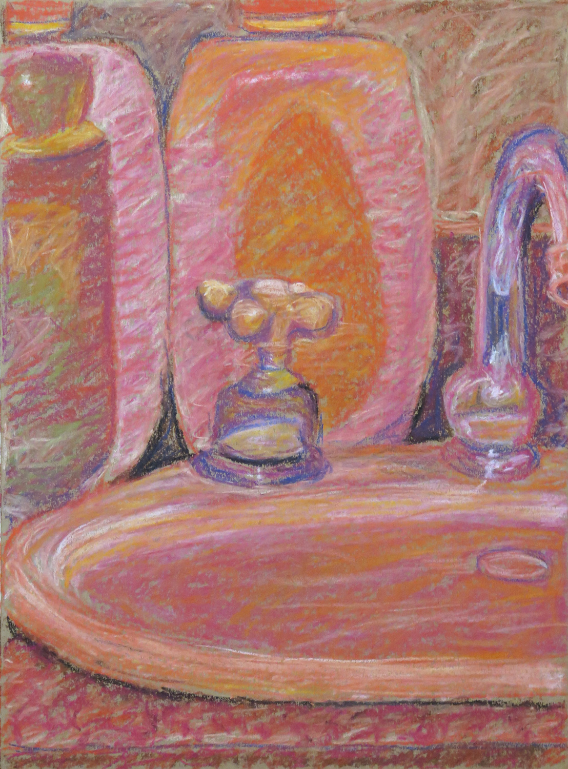
Bathroom still life

IMG_5295
Pastel on paper, 41.5 x 30 cm

Inspired by Ad Reinhardt, I was working towards the idea of making a monochrome red painting. In this sketch I tried to depict the actual colours and the values of the objects in different red tones.


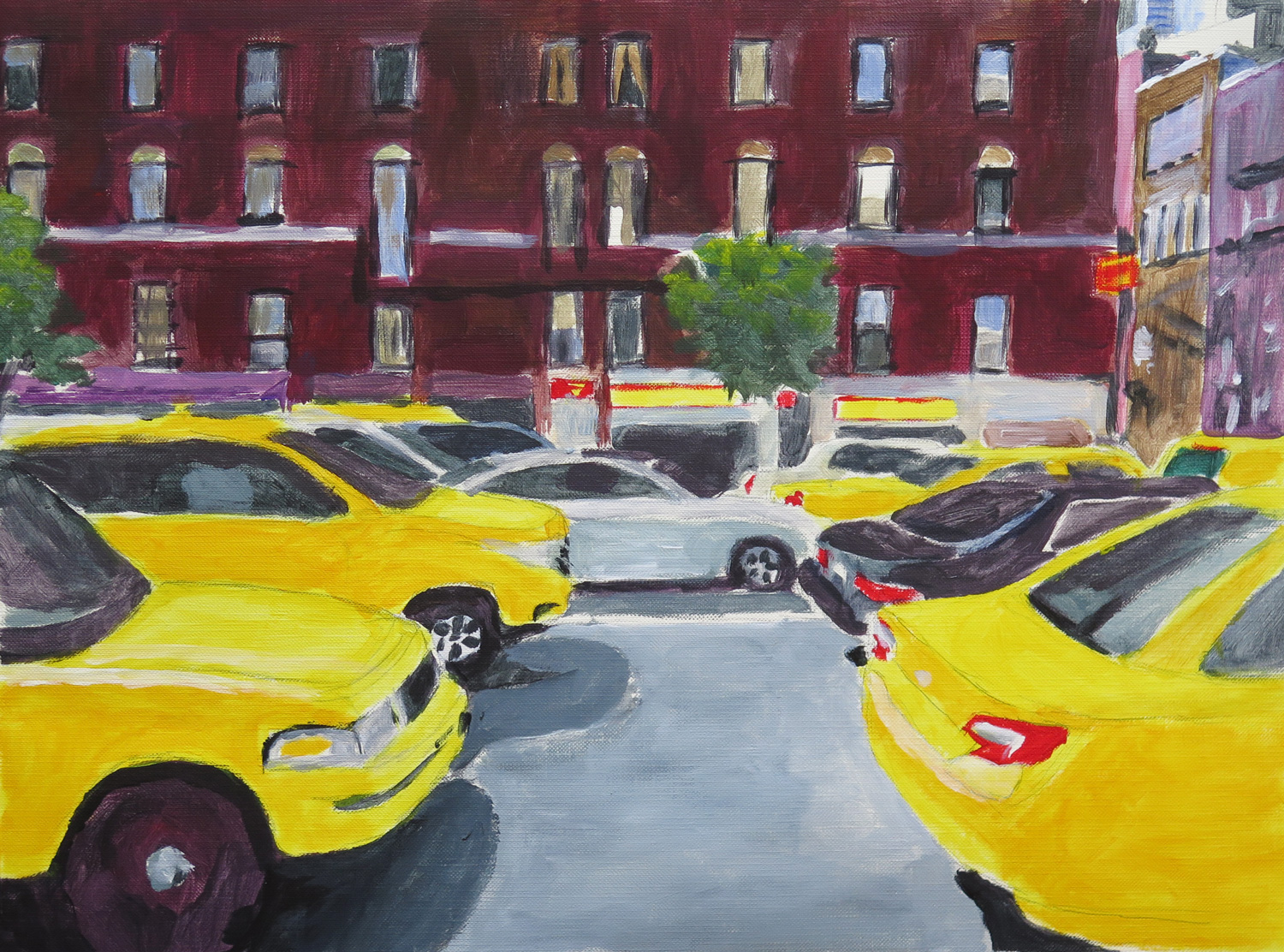
At the bus stop (R)
IMG_5297
Acrylics on paper, 31 x 31 cm

Response to Natalie’s A little walk around the town (Aktau, February 2016). I liked the casual treatment of the cars and went from there to make a painted sketch of a city view. Initially I wanted to capture the movement of the cars through blurring the painting, but then liked it as it was and retained the clear outlines.


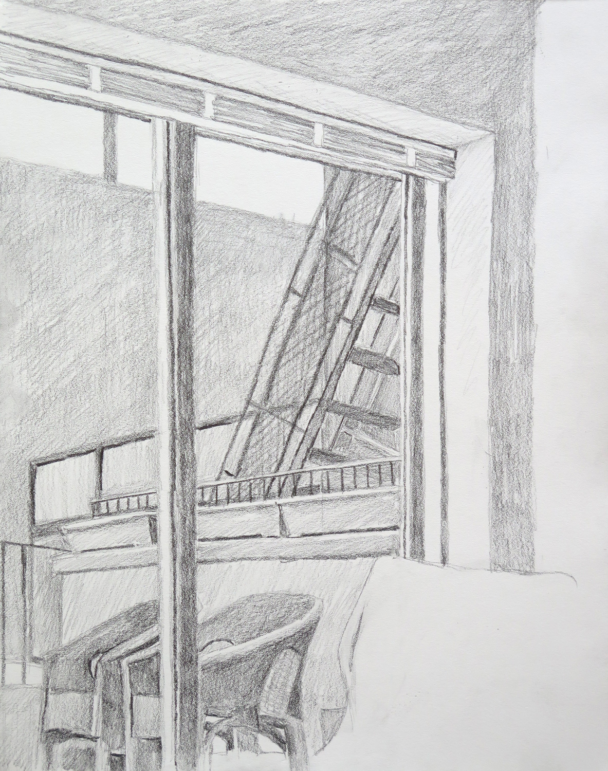
Terrace
IMG_5300
Pencil on paper, 35.5 x 28 cm

A study for a possible later painting where I’m aiming at abstracting from the objects towards a focus on the geometrical nature of the composition..


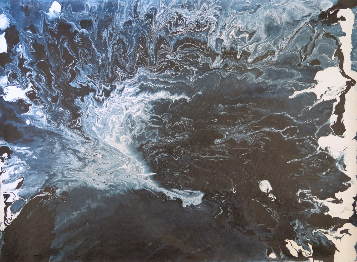
Deep water
IMG_5301
Latext enamel paint on canvas, 45 x 60 cm

Taking up an earlier idea to depict fluidity by pouring paint, I experimented with enamel paint thinned down to different degrees. Pouring on a flat surface and lifting the canvas to an angle made the paint follow gravity and move across the canvas.


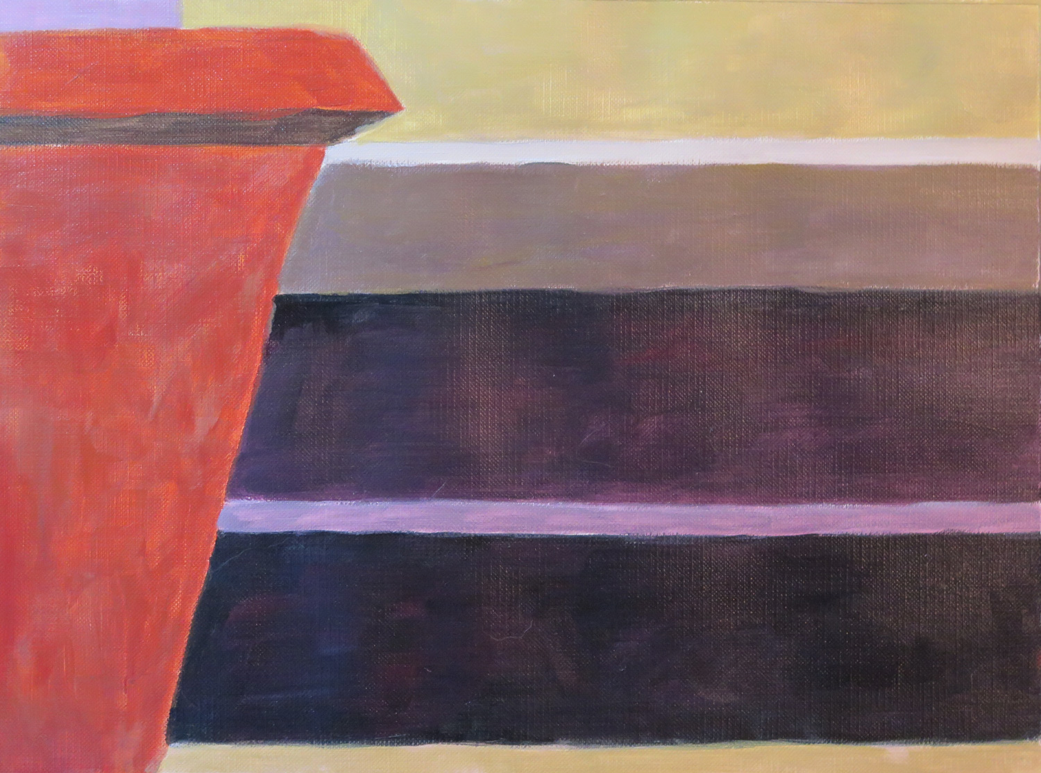
Looking out (R)
IMG_5306
Acrylics on paper, 23 x 30.5 cm

Responding to Natalie’s painting ‘Abandoned site’  (February 2016) and bringing further the idea of abstracting from an outdoor view. The painting is also related to the ‘Terrace’ sketch as it is a first step towards the idea of geometrical abstraction from real objects.


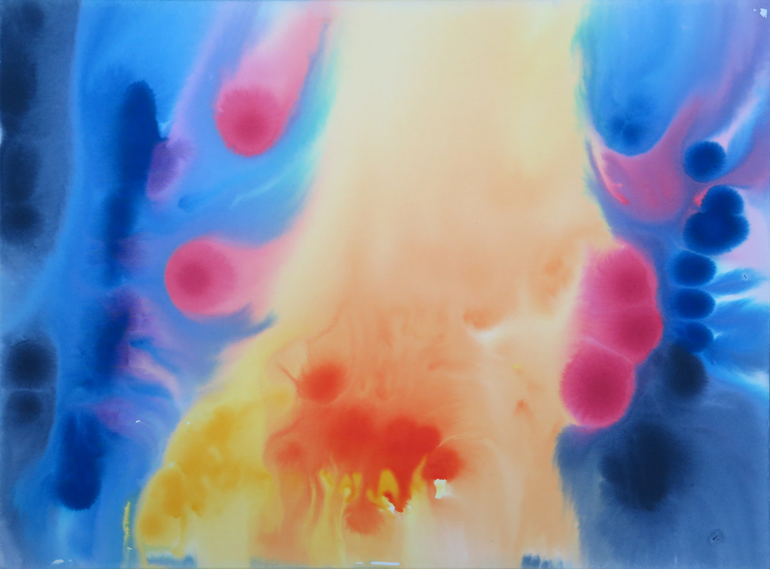
Floating shapes (R)
IMG_5308
Watercolour on illustration board, 38.5 x 51 cm

This piece is a response to Natalie’s sunset painting (February 2016). I took up the idea of a gradation in colour which I wanted to achieve through a wet-in-wet technique. The paint behaved differently from what I expected but I found the effects interesting. The shapes look like cells from a living organism.
Natalie: March


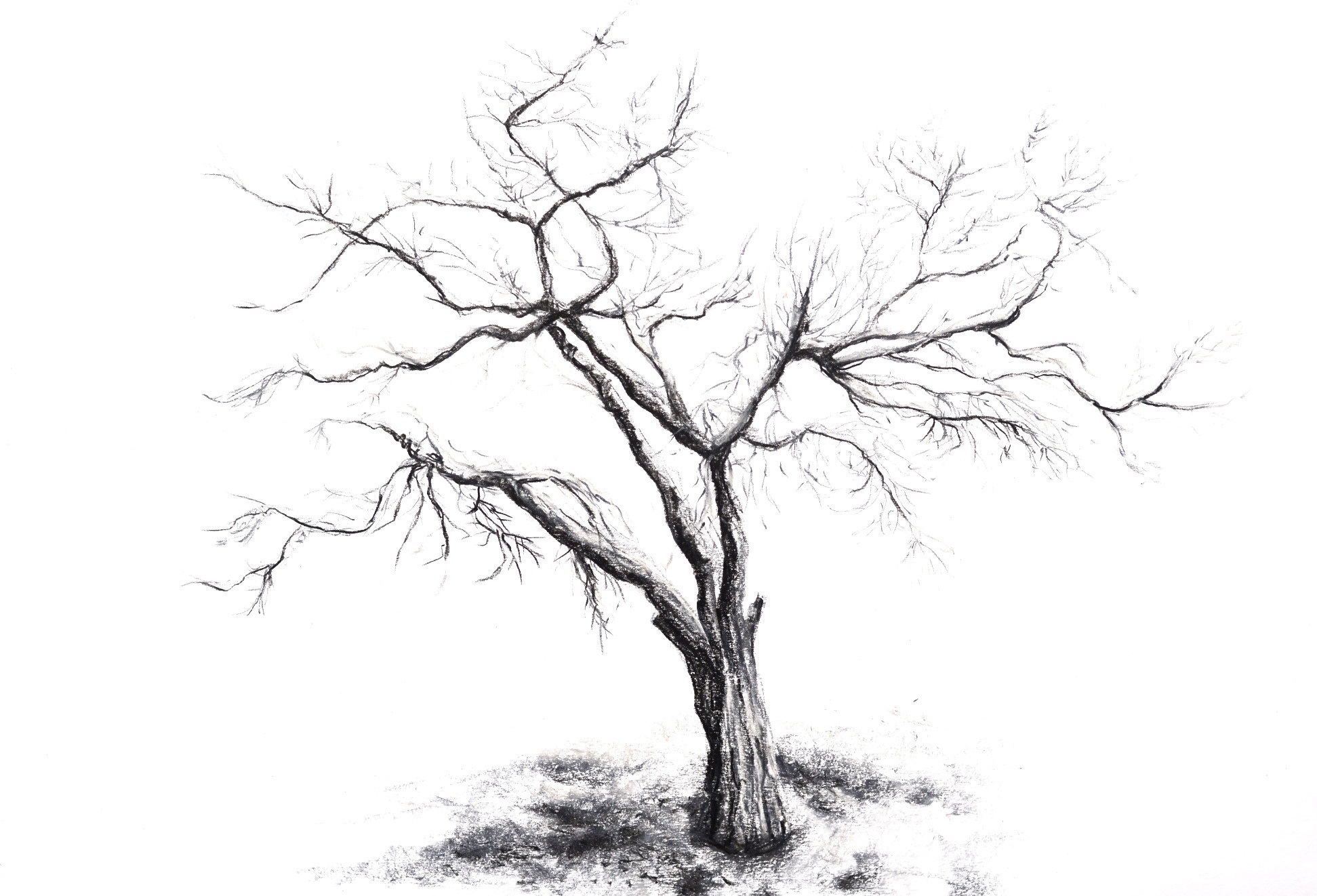
A tree (R)


Soft pastels on paper, 42 x 59 cm

This is my response to Patricia’s Potted plant (February). I just wanted to draw something natural and organic.


Sunshine


Watercolour on paper, 29 x 42 cm

The main focus of this study was to capture the sunlight of a mainly stormy looking day and make some progression towards a more abstract presentation of it.


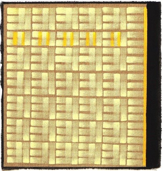
Managing the lights (R)


Oil on unprimed canvas, 23 x 24 cm

This is my response to Patricia’s New York Light (Male figure, February). This time I was under Rymann’s influence as well as Newman’s Zips (…still!). The idea was to pursue the study of medum in the same manner as Rymann did and see where it would lead me. It was much harder than I anticipated. Keeping the light lines straight was a real feat! I finished my study with Newman’s yellow and black Zips to represent the man from Patricia’s painting. It is not central but still dominant. I used unprimed cavas this time for the sake of experimentation, as I wanted to create a sense of light reflections on the otherwise untouched and clear ground.


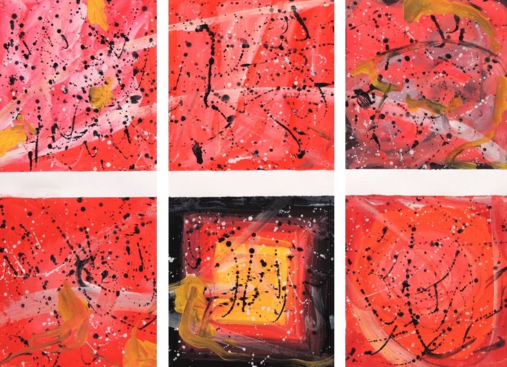
Colour relations (R)


Gouache on paper, 42 x 59 cm

This is my response to Patricia’s Abstract composition (February). It was pure indulgence in experimenting with red and letting my brushes and hands experience absolute freedom. This absolute freedom by the way was not entirely achieved, since Pollock and Rothko just wouldn’t leave me alone! I was essentially doomed, as any undergraduate art student who hasn’t yet developed their own style would most certainly be.


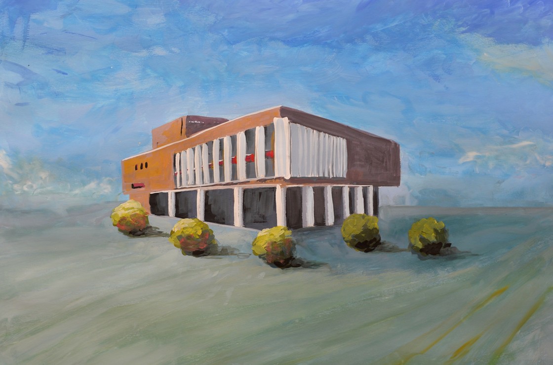
The architecture study 1

M1
Gouache on paper, 42 x 59 cm

This administration building is located on one of the central squares not far from my place of residence and I wanted to capture its almost proud setting, standing on its own. The square itself is very spacious and quite open and I aimed to encapsulate its essence accordingly. When you stand there you are completely surrounded by the sky and feel incredibly small… but not intimated though, as many large constructions can often induce you to feel.


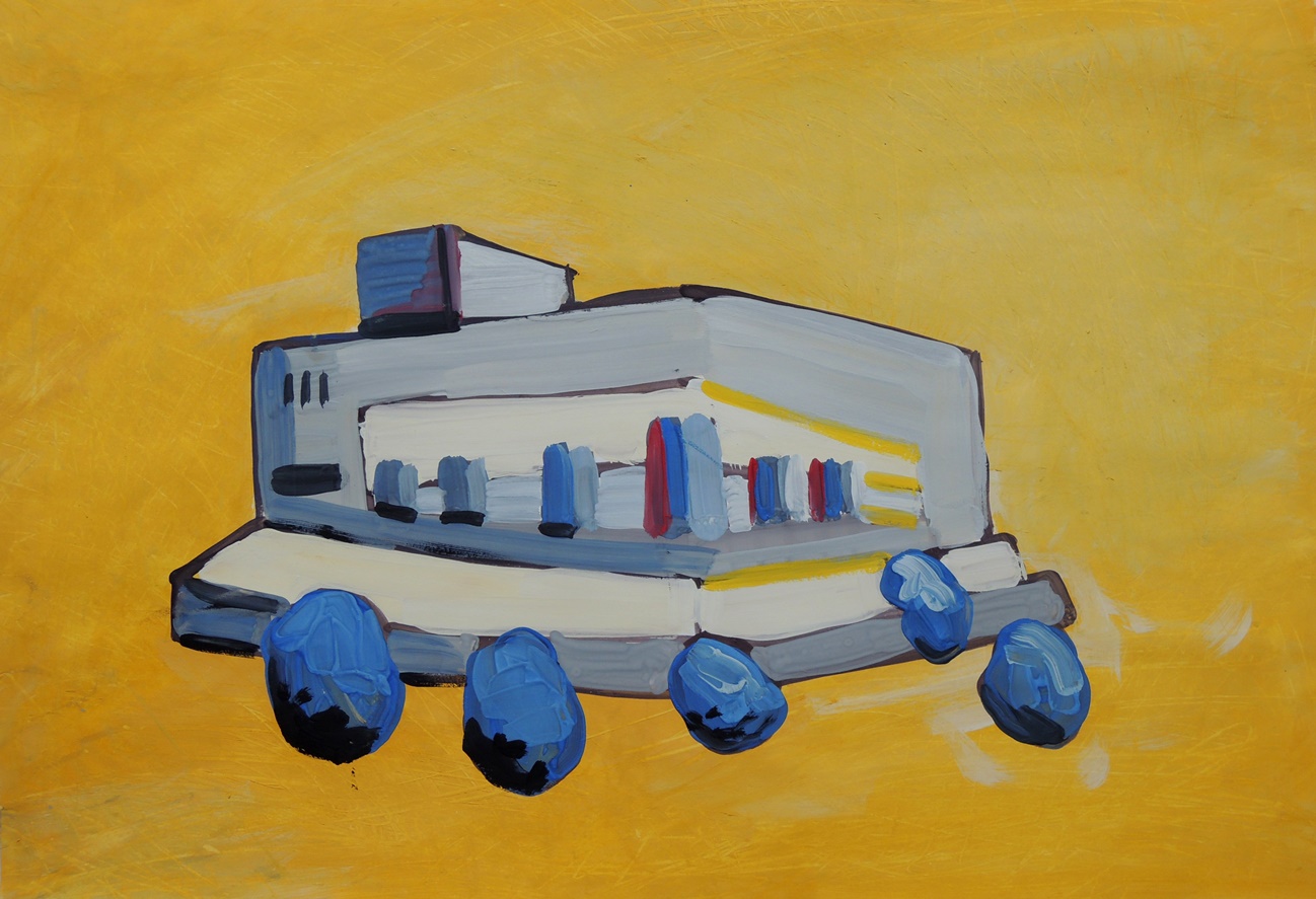
The architecture study 2

M2
Gouache on paper, 42 x 59 cm

This is an abstract progression from the Architecture Study 1 on the following day. This time I used yellow for the ground (sky) to represent the sunshine and to give a hint of the temperature in Kazakhstan… erm… to say that it can be hot wouldn’t even describe it!